1. Mashup of theories: Click Here
2. One point&Two point perspectives: Click Here and Click Here
3. 36 costume textures: Click Here
4. Final Submission: Below
5. Link to Lumion environment: Click Here
6. Like to SketchUp models: Click Here
From the Entrance, you have access to an upper level and the lower one. Most of the open space such as lecture theatre or library are situated on the upper level whilst the lower level contains offices and meeting rooms. This bridge reaches two side of a valley in Mount HUA in china which is a big nature reserve. Thus this building well practises the principle of being bionic and do not hurt the landscape.
The original concept of this bridge is one theory Frank Lloyd raised in the 1980s. That theory explains why a building shouldn't hurt the landscape around. Then I came across to a specific church which was designed by a pritzker awards wining architect, Peter Zumthor. Vertically and horizontally, I combined the theory and the plan, and came out with this multifunctional Bridge(School). As you can see, to name just a few, Computer lab and Gallery.
I personally define eco-friendly to be the main point of the theory and the computer lab is just a perfect example. The lab and other spaces, as can be seen from a bird view, are just reach-out spaces of the shape of the bridge. Using smoothed slope instead of using stairs is a attempt of space integration as stairs are inflexible. The shades of the sun reflected from the glass and shadow of the mountain makes the building a part of its surrounding environment.
Other than ordinary spaces, a lookout was designed to bring anyone closer to the nature by providing a space where people can just relax, with the spectacular view in front.
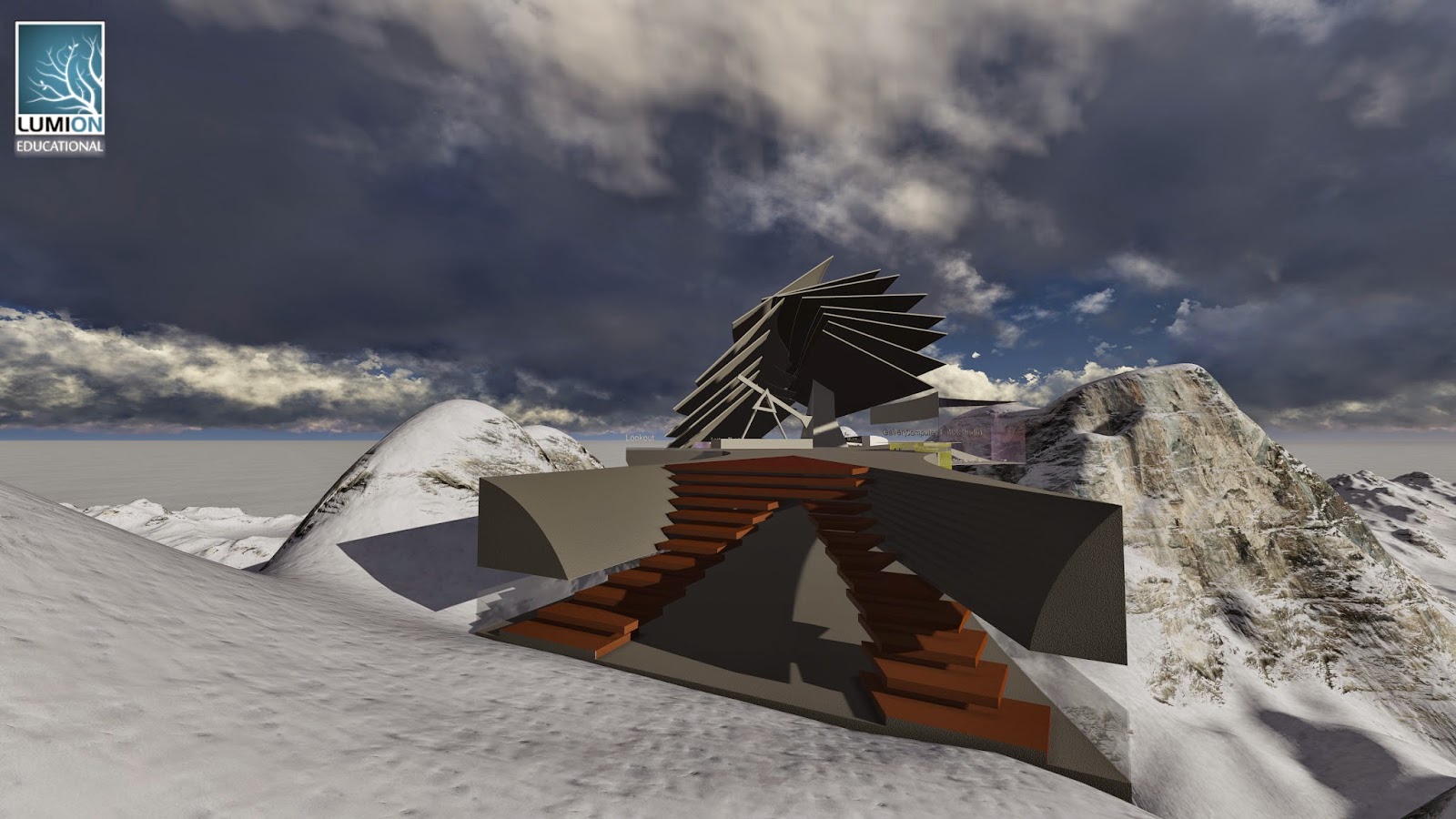
This is a glance of Moving element NO.1 from the upper level. This works like a perpetual motion machine as the proper use of two parts' gravity centre. Just like the theory mentioned, an artificial thing have the possibility of not being a harm of nature.
A glance of the upper Level. Library on the right of the image is in the centre of the bridge and the highest point in spite of the shading boards on the top. By vertically adopt the plan of Peter Zumthor's church, the 'tip' of the building is the library, just like in the natural landscape.
This is the folly and viewing of the bridge from the bottom of the valley. The folly also conducts the idea of not hurting the landscape by integrating with the mountain.
The school itself is the bridge and the school is a part of the bridge. Modern Contemporary design of the office and meeting areas. And this image shows the use of shading and its circular shape in contribute of making the bridge a part of the landscape.
Glancing from the sky, the whole view of the bridge(school).
pt.I Enter the bridge from the exit, then over the lecture theatre, meeting rooms and offices. Moving element no.1 is two lift cubical working as elevators over each space. Also this video pick will will take a closer look to the folly on the bottom of the valley.
pt.II showing you the no.2 moving element
pt.III from the entrance, the video takes you into the lower level of the bridge, more facilities will be shown.


